How to do I check link utilization in the map?
Link utilization
The Network Map has a Utilization view option that shows how much available capacity is being utilized on network links. The Utilization view lets you quickly assess how efficiently your network is managing traffic, and identify links that are over- or under-utilized. Utilization is displayed as colored arrows on link objects. Network utilization can be analyzed in the Network Map for all links in a link group.
The Utilization view option supports a limit of five active users at any one time. If more than five users are accessing the Utilization view, You will see a notification.
Information in the Utilization view is based on port egress statistics collected for IP links on Ethernet physical ports. Statistics must be supported and available for utilization to be displayed; see How are utilization statistics collected?.
The Utilization view option displays usage data for the following link types:
The Utilization view option supports physical map layout and region-based clustering, but region and zone icons cannot be opened while in the Utilization view option is enabled.
The Utilization Map shows NEs connected by link lines that represent physical connections between endpoints. When you hover over a link, its utilization level is displayed in the object tooltip. The links have the following features:
-
Thickness. The relative capacity on the link is indicated by a thin, medium, or thick line. Thinner lines indicate lower capacity, thicker lines indicate higher capacity. Link capacity is based on the operational port speed configured for the port.
-
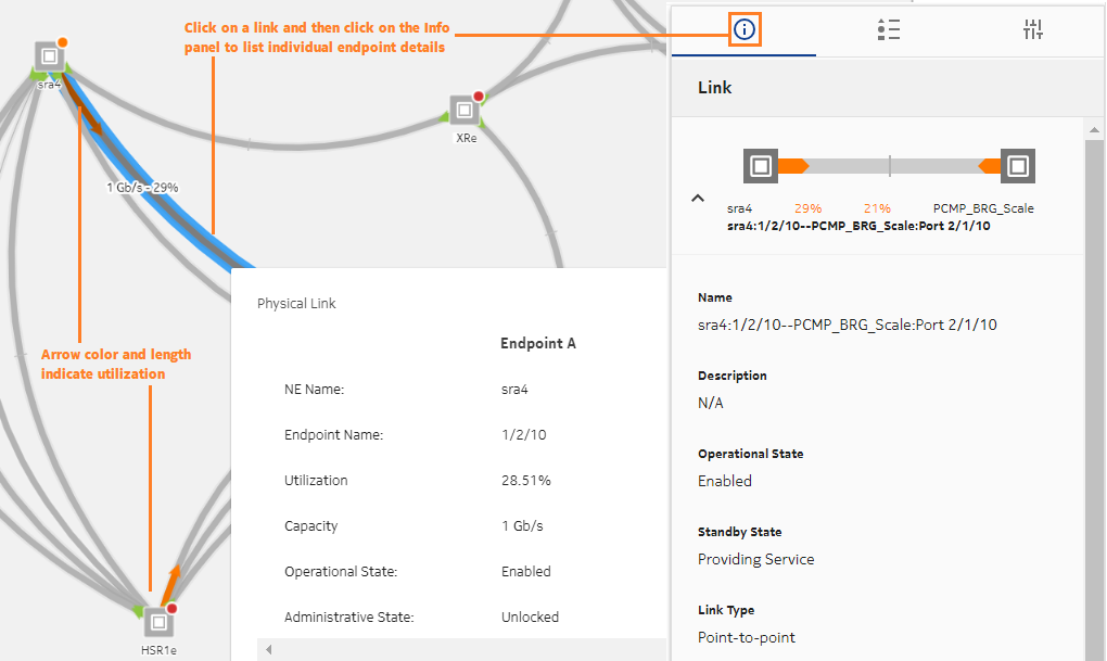
Color. Physical links between endpoints are shown in grey. Utilization is shown as a green, orange, or red arrow along the grey line. Each color indicates a range of utilization: low, medium, or high. The colors change as utilization (in percent) crosses preset thresholds.
-
Arrow length. The length of the colored arrow shows the relative utilization of the capacity on the link. Arrows grow from minimal utilization at an endpoint, to 100% utilization at the mid-point crossbar (for bidirectional links). The crossbar represents 100% utilization from either direction.
Utilization rates near zero will show a disproportionately long arrow (it may look like about 5%) to provide a visual cue that there is utilization on the link.
A grey line with no colored arrow means either zero utilization, or there is no data available for that link.
If utilization statistics are not supported on an NE, traffic may be present, but no utilization arrow is displayed.
To display link utilization
Detailed link information
You can click on a link and display detailed information relating to links and individual endpoints on the Info panel.
Managing link utilization map performance
The size of the resource group may affect performance. Consider the following:
-
If the number of links in the resource group is large, there may be a delay before the Utilization view option if fully enabled.
To maintain system performance and to avoid exhausting available statistics counters, consider creating groups of no more than 50 NEs for the purpose of link utilization monitoring. Your system administrator can create and modify resource groups.
-
Statistics are collected by subscription from qualified ports. If there are too many qualified ports in the resource group, performance may be affected. For information about Utilization map scale limits, see the NSP Planning Guide.
-
Be aware that Utilization map performance can also vary based on the number of subscriptions and on other telemetry gathering in the NSP system.
