NSP UI overview
Overview
The NSP UI provides access to all NSP functions, including direct access to product documentation. Available functions depend on which NSP installation options you specify during system deployment, as well as on your user access permissions. This section explains how to recognize and use common features of the NSP UI.
Note: This chapter is not applicable to the deprecated UI delivered in RPM-only deployments.
Banner bar
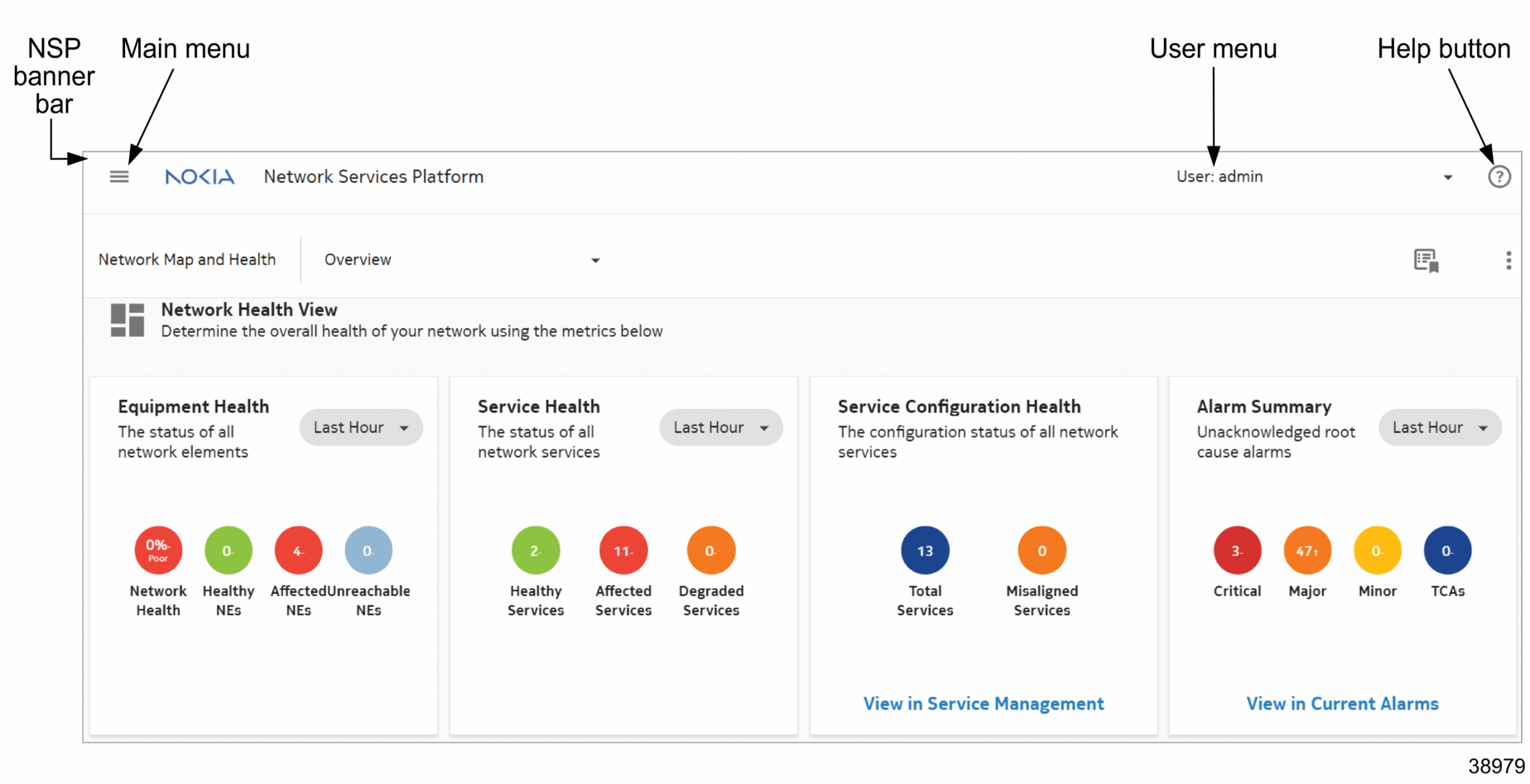
The NSP banner bar is accessible at the top at of every view and comprises the following elements:
Figure 1-2: Banner bar

Main menu
The NSP main menu provides access to the major functional areas of NSP. It is your primary navigation tool within the NSP UI. Main menu contents may vary depending on the feature packages installed and on your individual user permissions.
To access the main menu, click ![]() on the top left corner of the NSP banner bar. As detailed in
Table 1-3, NSP Main menu and views, the major NSP functions are categorized within the menu under the following functional areas:
on the top left corner of the NSP banner bar. As detailed in
Table 1-3, NSP Main menu and views, the major NSP functions are categorized within the menu under the following functional areas:
Note: You may see only a subset of the items in the main menu, depending on which feature packages have been licensed and which installation options selected for the deployment
Table 1-3: NSP Main menu and views
User menu
The user menu provides access to release information, linked URLs, and settings. Users can also change their password or sign out of NSP.
For more information about global user menu settings, see the NSP System Administrator Guide.
Help button
A ? button on the right-hand side of the NSP banner bar gives you access to the NSP user documentation. You can read Quick Help topics related to the current view, or click OPEN HELP CENTER at the bottom of the Quick Help menu to open the full NSP Help Center in a new browser tab. For more information about the NSP Help Center and its functionalities, see NSP Help Center.
Layouts
NSP UI layouts include dashboards, maps, diagrams, lists, and graphs.
The following topics offer more in-depth information about layouts and contextual options:
Keyboard-based navigation
You can use the keyboard to navigate and interact with many NSP views. Keyboard navigation allows you to highlight and select interactive elements using keystrokes instead of a pointing device.
Table 1-4: NSP UI accessibility options
|
Keystroke |
Action |
|---|---|
|
Tab |
Advance to next element |
|
Shift + Tab |
Return to previous element |
|
Alt + down arrow Option/Alt + down arrow in Apple/OSX |
Open pop-up or drop-down menu |
|
Shift + F10 Shift + Fn + F10 in Apple/OSX |
Open contextual menu |
|
Ctrl + c Command + c in Apple/OSX |
Copy |
|
Ctrl + v Command + v in Apple/OSX |
Paste |
|
Enter |
Open folder or expandable object such as tile Invoke action on button or menu item |
|
F8 Fn + F8 in Apple/OSX |
Move over larger elements or to next page |
|
F5 Shift + Fn + F5 in Apple/OSX |
Refresh |
|
Shift + F1 Shift + Fn + F1 in Apple/OSX |
Open tool tip |
|
Esc |
Close tool tip or menu |
|
Arrow |
After tile in matrix selected using Tab key, navigate among tiles Up and down arrows for navigation through items in open contextual or pop-up menu Up and down arrows for navigation between table rows Left and right arrows for navigation across table column headers |
|
Shift + right or left arrow |
Reorder data-table columns in selected header |