Creating baseline and anomaly charts

Purpose

This use case shows how to use NSP to chart baselines and anomalies.

The following prerequisites must be completed:

  • The required baselines have been created.

  • The baselines have been in active learning status for enough time to detect anomalies. Depending on the anomaly detector, this can be one or two seasons.

Steps
 

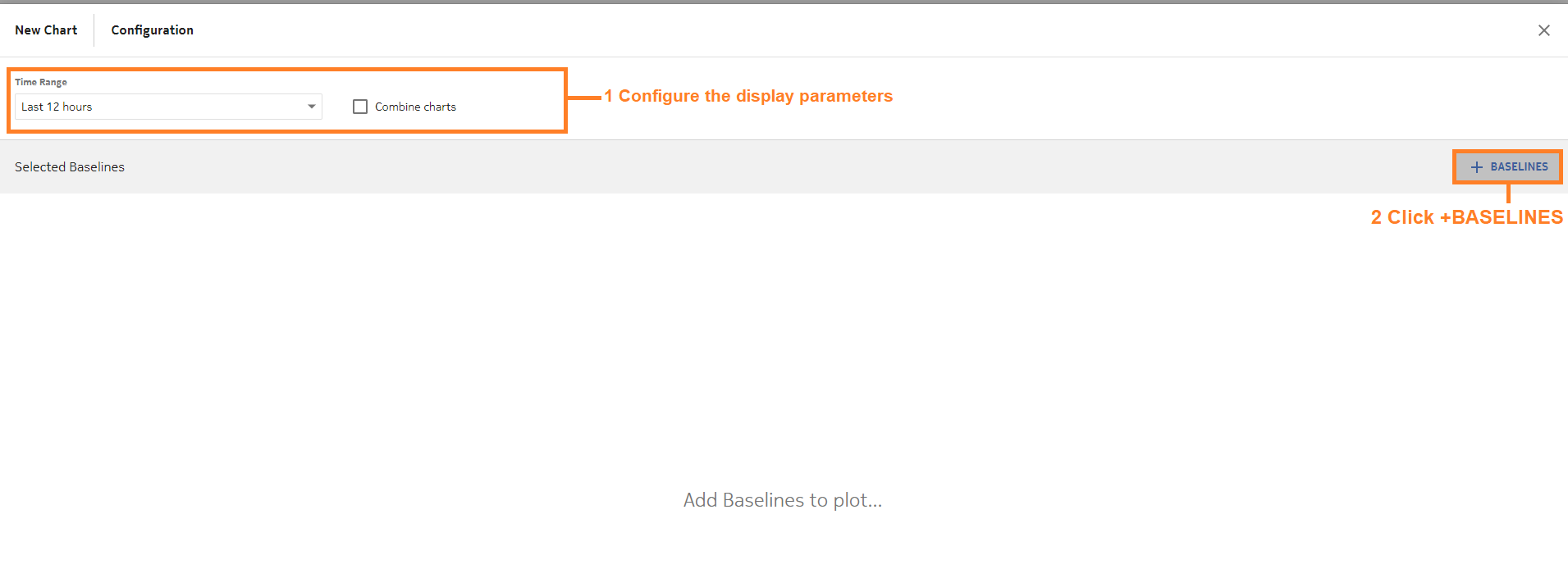
From Data Collection and Analysis Visualizations, Baseline Charts, we’ll create a chart.


Configure the time range parameter. To display multiple baselines on the same chart, enable the Combine Charts check box.


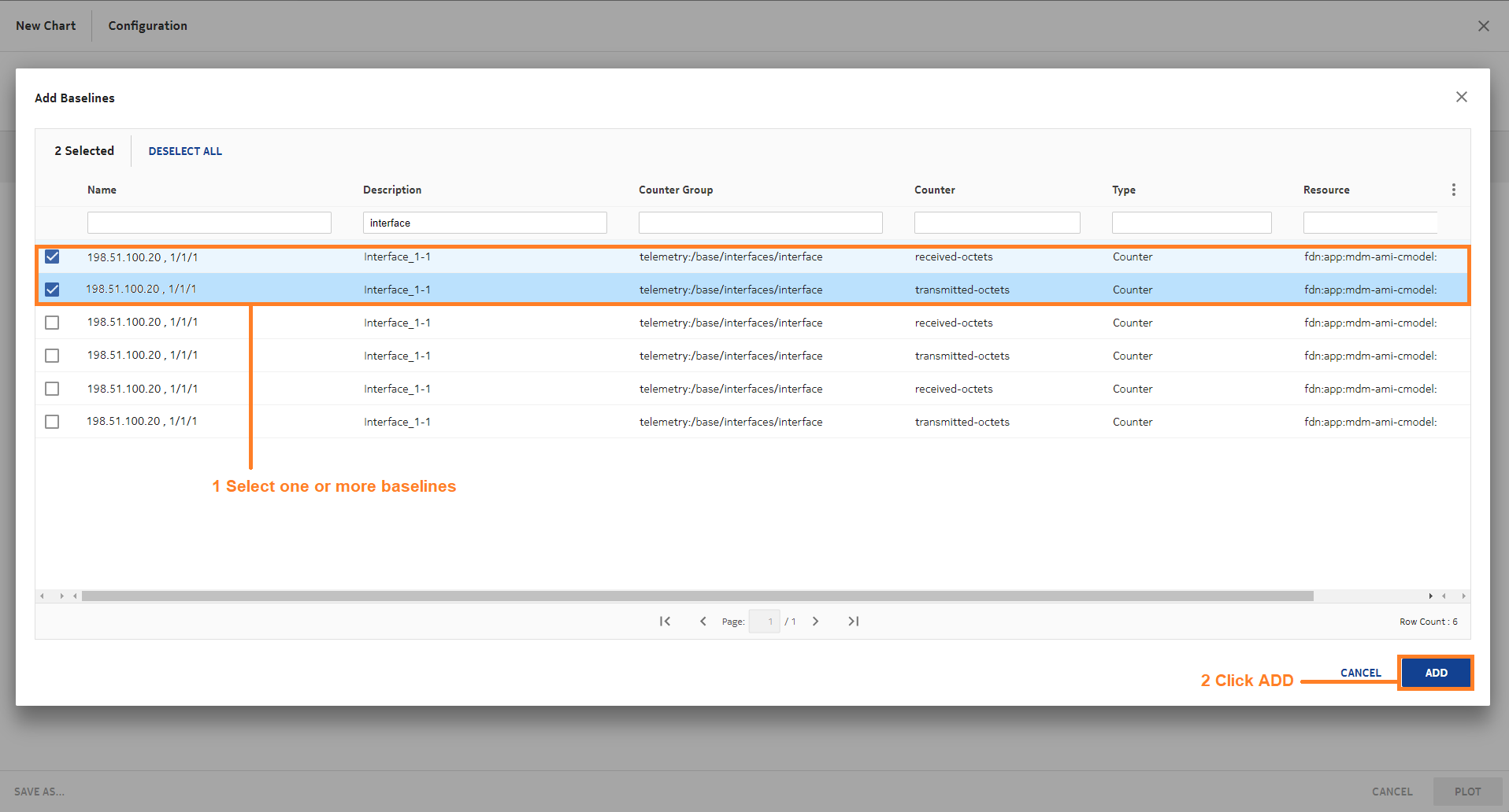
In the Add Baselines form, choose the baselines to chart and click ADD.

View the figure

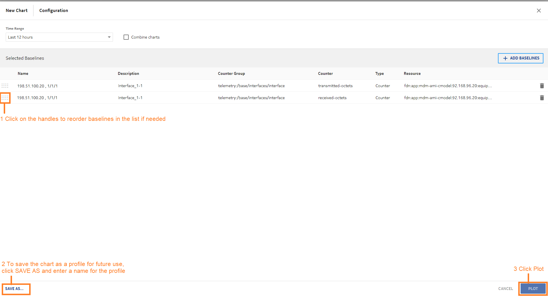
If you want to save the configuration for future use, click SAVE AS and enter a name for the chart.

Click PLOT to plot the chart.

End of steps

We’re done

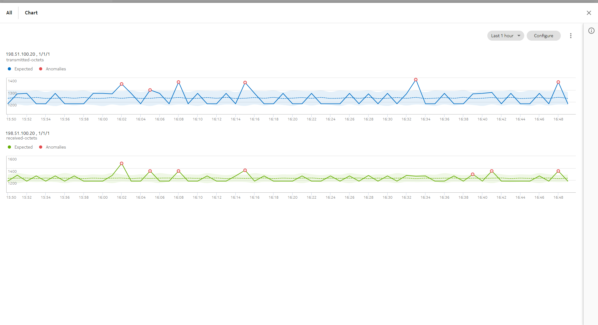
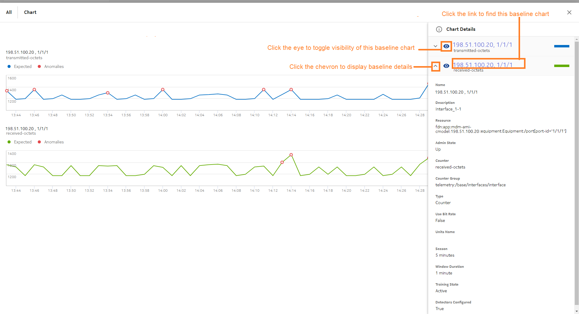
Visualizations displays a chart for each baseline.

The dotted line shows the expected values. The shading shows the detector threshold range, that is, the range of values that is not considered anomalous.

The solid line shows the actual values. Anomalies are indicated with red dots.

View the figure

Click Chart Details png5.png at the top right to display the Chart Details panel.

View the figure