What is the info panel?
Interacting with the info panel
The info panel displays on the right of various views and offers details about a selected object in maps, diagrams, lists, or graphs.
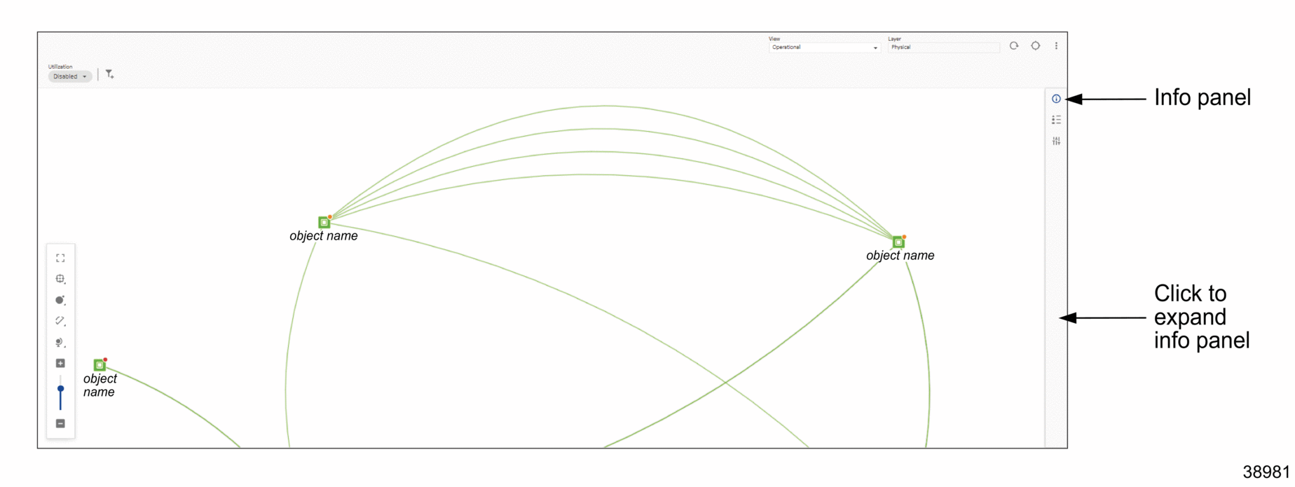
In most cases, the panel expands by default when opening a view. If it doesn’t, it can be displayed with ![]() or hidden with
or hidden with ![]() . The info panel can also be expanded by clicking
. The info panel can also be expanded by clicking ![]() (Summary); however, it can only be collapsed using
(Summary); however, it can only be collapsed using ![]() .
.
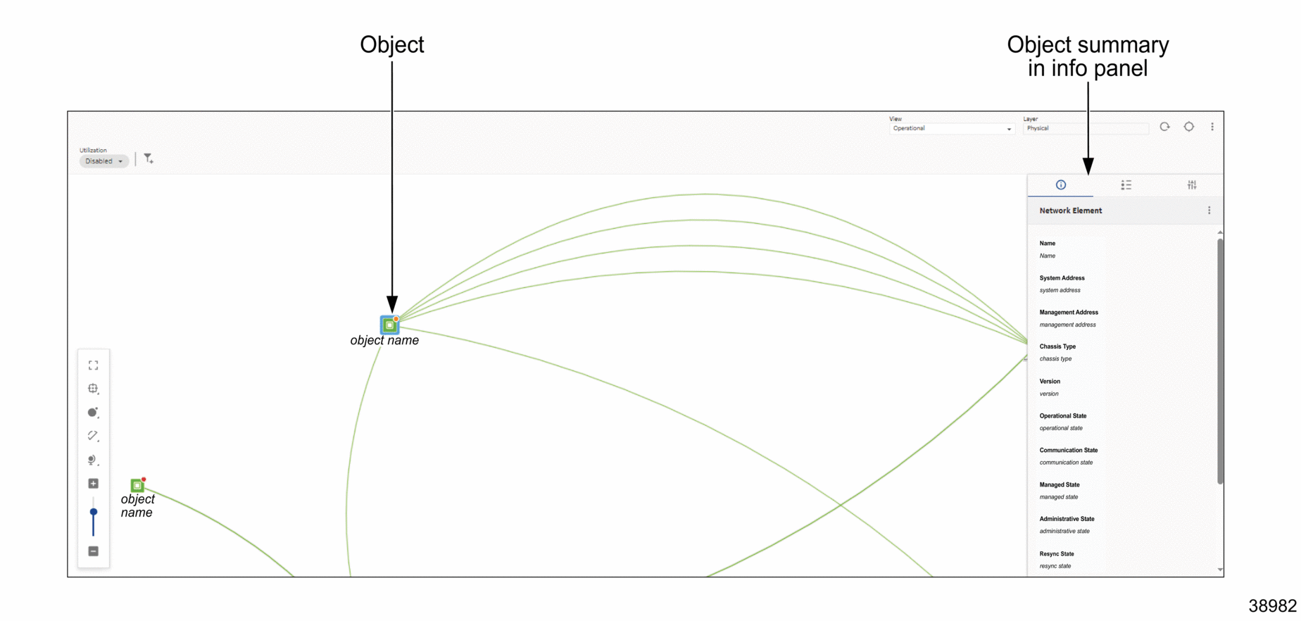
The info panel’s ![]() (Summary) provides more in-depth information about a selected object. This can be, for example, an NE in a list or an object in a map or diagram. Depending on context, the info panel may also display information such as
(Summary) provides more in-depth information about a selected object. This can be, for example, an NE in a list or an object in a map or diagram. Depending on context, the info panel may also display information such as ![]() (Legend),
(Legend), ![]() (Watched Filters),
(Watched Filters), ![]() (Mediation Policies),
(Mediation Policies), ![]() (Reachability Policies), and so on.
(Reachability Policies), and so on.
See the following examples for view/info panel combinations:
Figure 1-3: Info panel collapsed

Figure 1-4: Info panel expanded and object selected
