How do I track unhealthy service levels?
Unhealthy Services plot
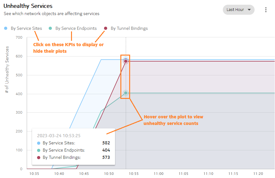
The Unhealthy Services dashlet tells you which network objects are affecting the function of your services. Service sites, service endpoints, and tunnel bindings are plotted separately against the number of services they are affecting over the specified time range.
You can display or hide plots by clicking on the By Service Sites, By Service Endpoints, or By Tunnel Bindings options to display or hide their plots on the graph.
To access the Unhealthy Services dashlet
1 |
Open Network Map and Health, Network Health View. The Unhealthy Services dashlet appears at the bottom of the Network Health view. End of steps |
Network monitoring pathway
Use the following dashlet features to expand on your network health investigation:
-
Scan unhealthy service counts: Hover over the plot to view the unhealthy service count by network object at a given time point. The unhealthyservice counts update as you move the cursor to the left or right along the plot.
Because of the scale of the unhealthy service plots, small fluctuations in unhealthy service counts may not be visible in the plots.
-
List service-affecting objects: view network objects that are affecting your services; see How do I list service-affecting network objects?
