Top Congested Access Network Location report
Top Congested Access Network Location report overview
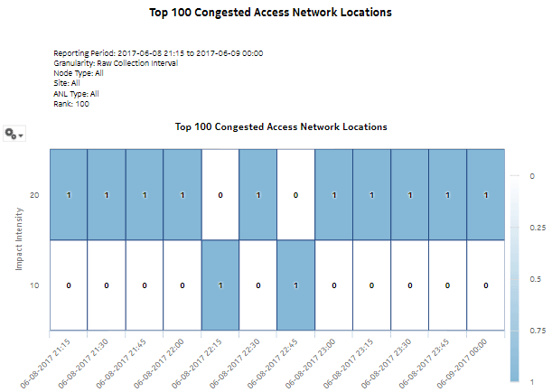
The Top Congested Access Network Locations report shows a ranking of the selected ANLs by impact intensity. The impact intensity value models the impact that congestion may have had on traffic flowing through the ANL for the selected time intervals. A higher value represents a higher potential impact, hence lower QoE for traffic at the location. The default appearance is a heat map: the vertical axis is the range of impact intensity bands, the horizontal axis is the time line, and the cell contents show the number of ANLs in a specific intensity band at a specific time.
Report characteristics
The following table lists the principal report characteristics.
Table 6-9: Top Congested Access Network Locations report characteristics
|
Characteristic |
Value | |
|---|---|---|
|
Statistics type |
AA Cflowd Flow Congestion | |
|
NSP Flow Collector required |
Yes | |
|
Report inputs |
Prompt |
Notes |
|
End date |
Calendar date or relative date (for example, two days ago) and time | |
|
Granularity |
Aggregation types: | |
|
Domain |
Mobile or Wi-Fi (DSM) | |
|
Report range |
Length of time to be reported, in minutes (minutes, min), hours (hours, h), days (days, d), weeks (w), or months (months, m). The 12 most recent intervals will be analyzed. | |
|
Node Type |
Search using partial names or wildcard (%). Select individual items or click Select All. | |
|
Node | ||
|
Access Network Location Type | ||
|
Rank |
Number of items to report | |
|
Drill-down support |
Yes—Open Top Congested Access Network Locations Details for the ANLs in the selected cell. | |
