Plot telemetry statistics

Purpose

Use this optional procedure to plot a chart of telemetry statistics. The steps for charting any type of telemetry statistic are the same: the example shows port throughput statistics.

This procedure is based on the procedure to plot a telemetry chart in the NSP Data Collection and Analysis Guide.

For example, the reference procedure in NSP 23.11 is How do I plot a telemetry chart?.

Before you begin

When you create a telemetry chart, you configure a telemetry filter. For historical data to be displayed, the data must be available in the database; see Create a telemetry subscription.

Charts are created by streaming to the plotter: historical data is queried and streamed to the plotter, then real time telemetry subscriptions are created and the data from these subscriptions is streamed to the plotter.

Data Collection and Analysis Visualizations times out if telemetry data is not received. The time-out limit is either double the collection interval or two minutes, whichever is greater.

Chart limit

Up to 10 objects can be charted at a time. The number of objects is the number of resources returned by the object filter, multiplied by the number of counters.

If your object filter returns one resource, for example, one NE, you can chart up to 10 counters for the resource.

Steps
CAUTION 

CAUTION

Service Disruption

The name of an object, including subscriptions, baselines, indicators, templates, and chart profiles, cannot contain a semicolon (;) or backslash (\).

The use of these characters in an object identifier will result in corrupted data that must be deleted by Nokia support.
Create a chart
 

Log in to the NSP as the Service Management user.


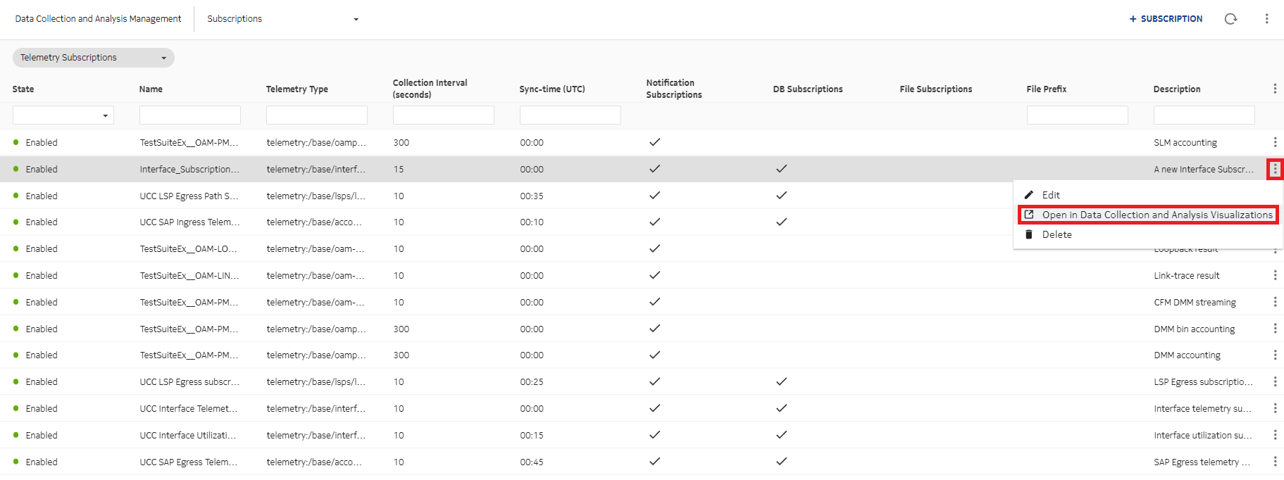
Open Data Collection and Analysis Management, Subscriptions.


Choose a subscription and click png38.png(Table row actions), Open in Data Collection and Analysis Visualizations.

The Data Collection and Analysis Visualizations view opens in a new browser tab.


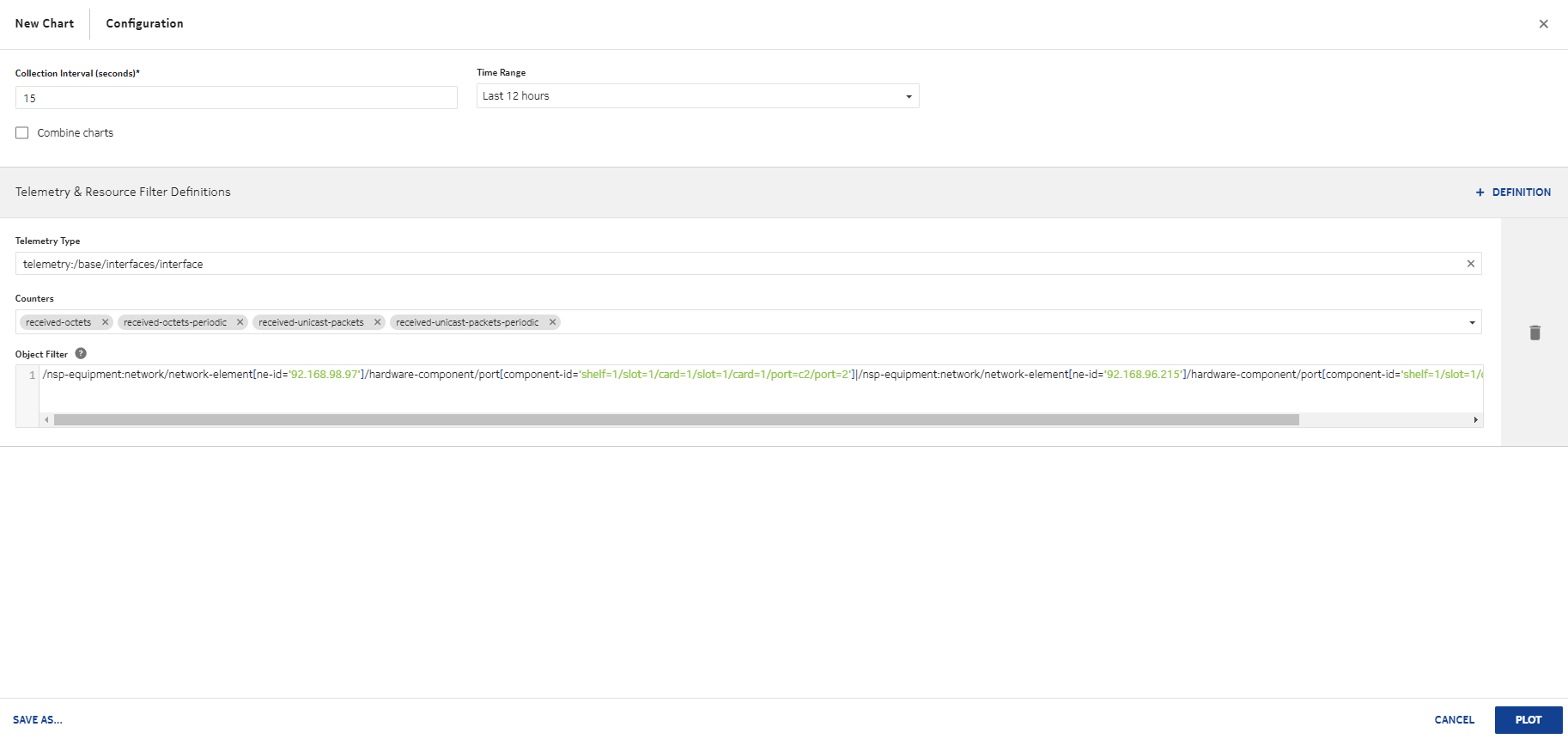
In the window that opens, configure the parameters in the top panel:

  1. Configure the Collection Interval parameter. If you are using NFM-P telemetry data, verify that the collection interval is long enough to allow time for Visualizations to receive the data before timing out.

  2. From the Time Range drop-down list, choose the amount of historical data to display.

  3. Click Combine charts to plot data from multiple data series on the same chart.


Click png6.pngDEFINITION.

The telemetry and resource filter definition panels are displayed.


Enter information in the Telemetry Type field. As you type, the field filters for available telemetry types to match your input.

Choose the telemetry type from the list of matches.


Choose counters to display from the Counters drop-down list.


In the Object Filter field, enter filtering information to filter the collected data.


Save the configuration as a chart:

  1. Click SAVE AS.

  2. In the window that opens, enter a name for the chart and add a description.

  3. Click SAVE.

In a few seconds, the chart is added to the list.


10 

Click PLOT.

NSP begins plotting data. In a few moments, data will be visualized in the chart.


11 

Close the chart window. The saved telemetry chart appears in the list, ready to be plotted again as needed.

End of steps