Dashboard designer
In EDA, you can construct your own dashboard pages to display the data you deem important for your operation.
The Dashboards page allows you to construct a dashboard, which itself can contain one or more layouts. Each layout is a separate dashboard page, selectable using a drop-down on the main dashboard.
Each dashboard layout can be either a page consisting of a collection of dashlets, each displaying its own source data; or a single list, which is a conventional data grid displaying a single set of source data.
For dashboard layouts, you can construct each layout by selecting from a set of pre-defined dashlets. Each dashlet can show a particular type of data like counters, lists, and charts. You can then add these dashlets to a page you design, optionally distributing them among a set of rows and columns you have specified within the page. Individual dashlets can be set to span multiple rows or columns.
For each list layout or dashlet layout in the dashboard, you define source data by constructing an EDA query, natural language query, GVK definition, or specifying a URL endpoint. You can then specify details about which parts of that data are displayed, set thresholds for highlighting, and make other formatting choices depending on the dashlet type.
Dashboard builder also supports filters. Filters use variable substitution to modify dashlet queries based on user input. For example, a dashboard which displays data for all TopoNodes can be filtered to display only data from a specific TopoNode.
The Dashboard designer only displays dashboards that were created by the current user. A future release will allow users to publish and share dashboards with other users.
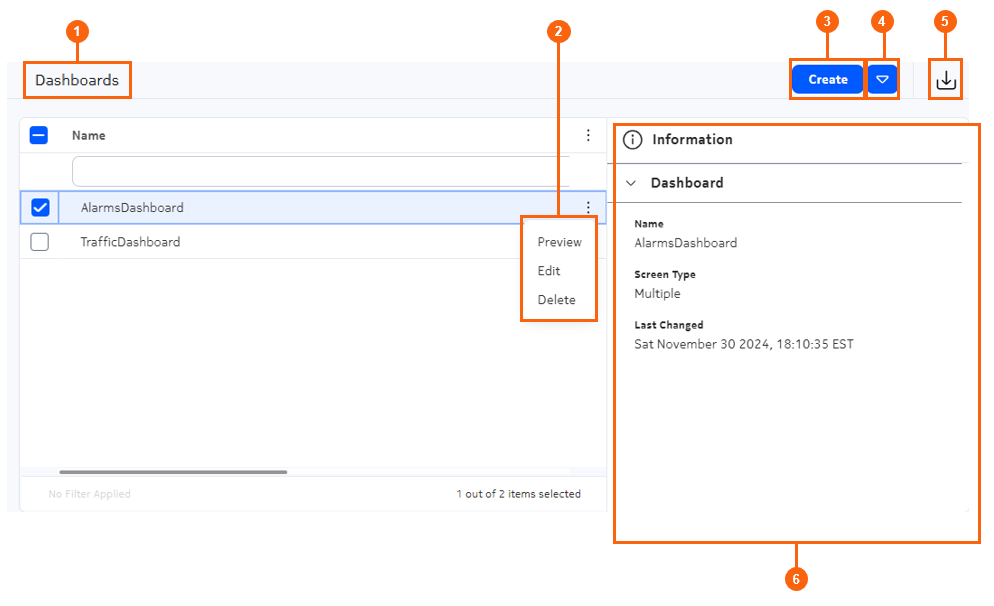
Dashboards page
The Dashboards page is the point from which you can access existing dashboards, and begin creating new dashboards.
| # | Name | Function |
|---|---|---|
| 1 | Breadcrumb bar | Displays the current position in the set of Dashboard designer pages. |
| 2 | Row actions | Clicking the Table row actions icon reveals the actions available for
dashboards displays in the data grid.
|
| 3 | Create | Click to open the Dashboard Designer view for a new dashboard. |
| 4 | Create List Layout | Click to open the Dashboard Designer view for a new dashboard consisting of a single list. |
| 5 | Import | Click to open a file selection dialog. Select the file for a previously exported dashboard and click Open to import the selected dashboard. The new dashboard is then displayed in the Dashboards list. |
| 6 | Information panel | A standard EDA information panel, displaying details about the selected dashboard. |
Dashboard designer page
The dashboard designer page is the space in which to create a dashboard and its constituent layouts, and to configure the data displayed on each.
| # | Name | Function |
|---|---|---|
| 1 | Definition/Library panel | The Definition tab displays basic parameters about the current
dashboard layout, like its name and description. The Library tab displays elements that you can add to the current dashboard layout: flex rows, flex columns, and dashlets. |
| 2 | Layout panel | This is the area that displays the dashboard layout you are
designing. Drag objects from the Libraries tab into this space to add elements to the dashboard layout. Select objects in this panel to view and configure their properties in the Properties tab. |
| 3 | Properties | The Properties tab displays properties for the current dashboard, and
for the row, column, or dashlet currently selected in the layout
panel. Use this tab to configure the basic display properties for the dashboard. |
| 4 | Filter configuration panel | Filters are an optional way to modify the data underlying dashlets contained on the dashboard. Use this panel to configure one or more filters for the current dashboard. Once a filter is configured, you can include a corresponding "where" clause in the queries underlying individual dashlets. Enable the Show filters bar property to display a widget on the layout panel that allows you display and use specific filters you have configured. 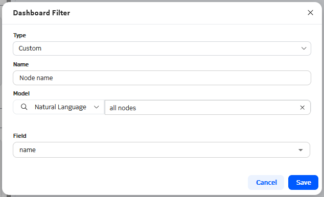 See the procedure for creating dashboard filters for the steps to create a filter, add a reference to the queries for dashlets, and use the filters to constrain the data displayed by those dashlets. |
| 4 | Add | Click to add another dashboard layout to the dashboard. |
| 5 | Add List Layout | Select this option in the drop-down to add a List page to the dashboard. |
| 6 | Save | Click to save the current dashboard design. |
| 7 | Reset | Click to discard all changes since you last saved the layout, after confirmation. |
| 8 | More icon | Click to view a list of available actions for the current
Dashboard:
|
Flex grids
Flex grids are the underlying structure of a dashboard. You must add at least one flex row or flex column to the dashboard before you can then fill the resulting grid with individual dashlets.
To add a flex row or flex column to a dashboard design, drag the flex row or flex column from the Library panel onto the Layout panel.
You can add a series of rows and columns to create a customized grid for your dashboard design. Each cell in the grid can then accept one or more dashlets.
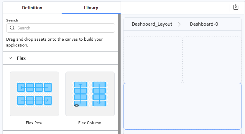
- Vertical Alignment: the vertical position of any dashlets that are placed in that cell.
- Horizontal Alignment: the horizontal position of any dashlets that are placed in that cell.
Dashlet types
Dashlets are the building block from which you can build your dashboard. Several types of dashlets are available in EDA; each can be dragged and dropped on to your dashboard design. If you have added flex columns or rows, you can distribute dashlets within the resulting grid.
The counts dashlet
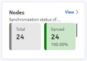
The counts dashlet displays a simple count of qualifying instances of something in EDA. You select a data source, and can then specify criteria to distinguish qualifying instances of the selected data that are counted and highlighted, versus the basic number of all records in the selected data source.
| Property | Description |
|---|---|
| Common properties | |
| Title | The title of the dashlet when displayed in the EDA UI. |
| Subtitle | A subtitle, displayed below the title and in a smaller font. |
| Navigation target | Adds a View button to the dashlet that, when
clicked, opens a selected page within the EDA UI. The target can be:
|
| Fill available width | Dynamically changes the dashlet width based on the browser window and neighboring dashlets. |
| Dashlet width | The relative width of the dashlet. |
| Dashlet height | The relative height of the dashlet. |
| API Specification | |
| Query | Click the More icon to open a page on which to configure the data
source for this dashlet. On that page you configure the data source as one of the following:
|
| Counters | These properties configure the highlighting of values that meet
criteria on the counts dashlet:
|
| Additional dashlet properties | |
| Show total | Indicates whether to display a count of all values retrieved in the source data set should be displayed on the chart, in addition to qualifying values. |
| Show total at end | When the total is shown, controls the position of the total display. Toggles between the total being the first count, or the last. |
| Show percentage | Indicates whether the counter should display what percentage of all values are represented by qualifying values. |
| Vertical lists | When the total is shown, controls the position of the total count and qualifying count. Toggles between the total being above, or below the count of qualifying values. |
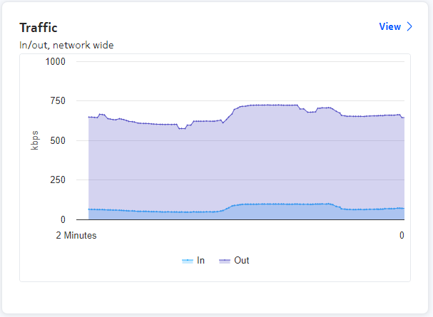
The line chart dashlet
A line chart dashlet places a line chart on the dashboard layout. It supports both stacked line charts (in which values are successively added to show a series of cumulative totals) and overlaid (a standard line chart in which values are displayed independently, not as a sum).
| Property | Description |
|---|---|
| Common properties | |
| Title | The title of the dashlet when displayed in the EDA UI. |
| Subtitle | A subtitle, displayed below the title and in a smaller font. |
| Navigation target | Adds a View button to the dashlet that, when
clicked, opens a selected page within the EDA UI. The target can be:
|
| Fill available width | Dynamically changes the dashlet width based on the browser window and neighboring dashlets. |
| Dashlet width | The relative width of the dashlet. |
| Dashlet height | The relative height of the dashlet. |
| API Specification | |
| Query | Click the More icon to open a page on which to configure the data
source for this dashlet. On that page you configure the data source as one of the following:
|
| Chart Configuration | These properties control the display of the line chart:
|
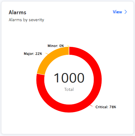
The donut dashlet
A donut dashlet places a pie chart on the dashboard layout. You must configure a data source, and then set criteria for various pie slices describing qualifying subsets of that data. Many parameters are available to control the way the appearance of the chart and the individual pie slices.
| Property | Description |
|---|---|
| Common properties | |
| Title | The title of the dashlet when displayed in the EDA UI. |
| Subtitle | A subtitle, displayed below the title and in a smaller font. |
| Navigation target | Adds a View button to the dashlet that, when
clicked, opens a selected page within the EDA UI. The target can be:
|
| Fill available width | Dynamically changes the dashlet width based on the browser window and neighboring dashlets. |
| Dashlet width | The relative width of the dashlet. |
| Dashlet height | The relative height of the dashlet. |
| Charts | |
| Charts | A single pie chart dashlet can include multiple pie charts. Use this space to add and configure each pie chart. After configuring a pie chart, click the + icon to add and configure an additional pie chart for this dashlet. |
| Donut Chart Details An individual pie chart within the donut dashlet is configured on this page. |
|
| Query Definition | Specifies the data source on which the pie chart's segments is based.
Choose from:
|
| Hide title | Indicates whether to show the chart title on the chart, or not.
Toggles Yes or No. |
| Show total | Indicates whether the sum of all segments should be displayed on the
chart, or not. Toggles Yes or No |
| Show slice labels |
Indicates whether each chart segment should display a label for its data. Possible values: All, Percent, None |
| Slices: these properties control the display
of each slices in the chart. Configure and add as many slices as your chart requires. |
|
| Label | Indicates whether this slice should display its own label. |
| Color | The shading color applied to this slice. |
| Field | From the selected data source, the individual field corresponding to this slide. |
| Criteria | The logical criterion for this slide (Equals, Not Equal, Greater Than, Less Than) |
| Value | The fixed value against which the current field value and the Criteria are compared. |
| + | Click this icon to add the slice configuration to the set of slices included in this chart. |
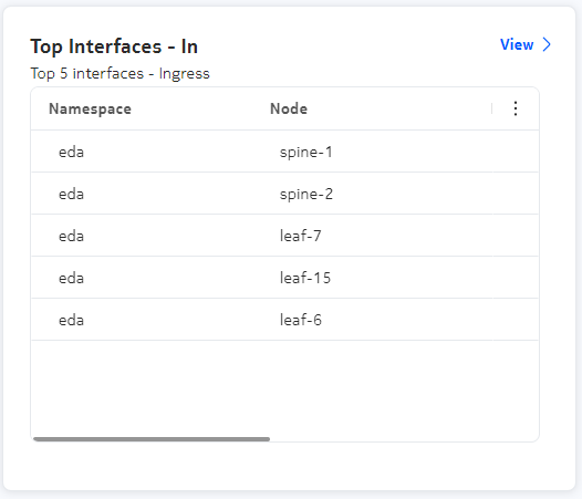
The data view dashlet
A data view dashlet places a data grid on the dashboard. You must specify a data source as part of the dashlet design..
| Property | Description |
|---|---|
| Common properties | |
| Title | The title of the dashlet when displayed in the EDA UI. |
| Subtitle | A subtitle, displayed below the title and in a smaller font. |
| Navigation target | Adds a View button to the dashlet that, when
clicked, opens a selected page within the EDA UI. The target can be:
|
| Fill available width | Dynamically changes the dashlet width based on the browser window and neighboring dashlets. |
| Dashlet width | The relative width of the dashlet. |
| Dashlet height | The relative height of the dashlet. |
| Charts | |
| Query | Click the More icon to open a page on which to configure the data
source for this dashlet. On that page you configure the data source as one of the following:
|
| Show information panel | Indicates whether an information panel should be available on this dashlet. |
| Show status bar | Indicates whether to include a status bar on the dashlet, showing (for example) whether any filters are applied, and the total number of rows in the list. |
The bar chart dashlet
A bar chart dashlet places a bar chart on the dashboard layout. It supports both horizontal and vertical bar charts.
You can also configure the chart to show stacked bars contributing to a total value, with the elements in the stack indicated as either a raw value or a percentage of the whole.
| Property | Description |
|---|---|
| Common properties | |
| Title | The title of the dashlet when displayed in the EDA UI. |
| Subtitle | A subtitle, displayed below the title and in a smaller font. |
| Navigation target | Adds a View button to the dashlet that, when
clicked, opens a selected page within the EDA UI. The target can be:
|
| Fill available width | Dynamically changes the dashlet width based on the browser window and neighboring dashlets. |
| Dashlet width | The relative width of the dashlet. |
| Dashlet height | The relative height of the dashlet. |
| API Specification | |
| Query | Click the More icon to open a page on which to configure the data
source for this dashlet. On that page you configure the data source as one of the following:
|
| Chart Configuration | These properties control the display of the line chart:
|
Using the dashboards list
-
Open the Dashboards page in the EDA GUI by selecting .
The Dashboards list displays, showing all currently configured dashboards.Note: By default, the list shows Custom dashboards. The Core dashboards list (selectable using a drop-down the navigation bar at the top of the page) is not currently enabled.
-
Do any of the following:
- To preview an existing dashboard, click the Table row actions icon and select Preview from the displayed list.
- To edit an existing dashboard, click the Table row actions icon and select Edit from the displayed list.
- To delete an existing dashboard, click the Table row actions icon and select Delete from the displayed list, then click OK in the resulting confirmation dialog.
Designing a dashboard
- creating the new dashboard
- adding a single layout: either a list layout, or a dashboard layout consisting of one or more dashlets
- configuring the data source for each list or dashlet, and configuring the appearance and behavior of each.
- optionally adding more list or dashboard layouts to the same dashboard
- saving your layout
-
Open the Dashboards page by selecting form the navigation menu.
This opens the Dashboards page, showing a list of already-configured dashboards.
- Choose one of the following:
- Use the drop-down control beside the Create button to select Create List Layout.
-
In the Definition panel, configure basic properties for
the dashboard:
- Layout name: an internal name for this layout. This name cannot include spaces or special characters.
- Display name: the name for this layout, as displayed within the EDA GUI. Unlike the layout name, you can include spaces in the Display name.
- Description: an optional description of the layout and its purpose.
- Show navigation toolbar?: governs whether a breadcrumb bar displays above the dashboard.
- Click on the list in the center configuration panel to reveal properties for the list in the Properties panel.
-
Configure display properties for the list:
- Show information panel
- Show status bar
- Show column filters
-
Configure the source data for the list:
- Go to step 20
- Click Create.
-
In the Definition panel, configure basic properties for
the dashboard:
- Layout name: an internal name for this layout. This name cannot include spaces or special characters.
- Display name: the name for this layout, as displayed within the EDA GUI. Unlike the layout name, you can include spaces in the Display name.
- Description: an optional description of the layout and its purpose.
- Show navigation toolbar?:
-
In the Properties panel, configure screen properties for
the dashboard:Screen Name:
- Screen Name
- Screen Type: This is set to Dashboard and cannot be altered.
- Show screen in Navigation Bar?:
- Default screen when layout is loaded?:
-
Optionally configure one or more filters for this dashboard.
Note: See the separate procedure for creating a dashboard filter for the steps to:
- configure one or more dashboard filters
- modify the queries underlying one or more dashlets to incorporate those filters
- Click the Library tab to configure the dashboard layout.
-
Optionally, add rows and columns to the dashboard:
Note: You can arrange dashlets on the dashboard even without creating rows and columns in advance; but configuring a grid gives you more control over dashlet positioning, and allows you to configure dashlets to span multiple cells in the grid arrangement.
- To add rows to the dashboard, drag the Flex Row control into the layout panel. Repeat this to add more rows to the dashboard.
- To add columns to the dashboard, drag the Flex Column control into the layout panel. Repeat this to add more columns to the dashboard.
- In the Properties panel, configure the flex row or flex column you added by setting the Vertical Alignment and Horizontal Alignment properties.
- Add a dashlet to the dashboard by selecting a Dashlet control from those displayed, and dragging it into the layout area. If you previously added rows or columns, drop the dashlet into the appropriate position.
- Click on the dashlet in the center configuration panel to reveal properties for the dashlet in the Properties panel.
-
Configure the dashlet by setting:
- Screen properties (these are common to all dashlets).
- Dashlet properties (some are common to all dashlets; others vary by dashlet type).
Note: See the topics for dashlet types for details about the individual parameters available for each type of dashlet. -
To configure the source data for the dashlet (among the dashlet
properties):
- Repeat steps 15, 17 and 18 to add more dashlets to the dashboard if required, until all dashlets are configured.
-
Do any of the following:
- To save your dashboard, click the Save icon.
- To add a new dashboard layout to your dashboard, click Add.
- To add a new list layout to your dashboard, use the drop-down beside the Add control to select Add list Layout.
- To preview your dashboard, click the More icon and select Preview Saved Changes from the list of actions.
- To save your dashboard layout as a file, suitable for others to import into their EDA system, click the More icon and select Export from the list of actions.
Creating a dashboard filter
For example, a dashboard which displays data for all TopoNodes can be filtered to display only data from a specific TopoNode you specify in the filter field.
- Configure one or more filters on the dashboard design page.
- For each dashlet to which a dashboard filter should apply, edit the
dashlet's underlying query to include a "where" expression referring to one
or more of the dashboard filters. Note: A sample of each filter's "where" expression is displayed on this page to help you with the correct syntax. A field also displays on this page for each dashboard filter, and you can test the filters by entering values in those fields.
- On the dashboard design page, enter values into one or more of the filter fields. All dashlets on the dashboard whose underlying query incorporates a filter then update to display only results that satisfy that filter.
- String filter: allows you to add a simple string filter field. As part of
each dashlet's query design, you specify a field within the data set against
which the filter string is compared. The "where" clause for a string filter
resembles
where (<column> = "${StringFilter}"). - Custom filter: allows you to create a specify a particular field among query
results, whose value must match what is entered later as the filter value.
The "where" clause for a custom filter resembles
where (<column> = "${CustomFilter}"). - Name/Namespace: constrains query results to only those associated with a
particular name and namespace you enter later as the filter value.
A Name/Namespace filter is like a Custom filter for which Name/Namespace is hard-coded as the selected filter field. The "where" clause for a Name/Namespace filter resembles
where (<column1> =
                                "${NNFilter.name}" and <column2> =
                                "${NNFilter.namespace}")
.namespace.node.srl.interface.statistics where (out-octets != 0 and in-octets != 0 and .namespace.node.name = "${nodename}" and .namespace.name = "${target.namespace}" and .namespace.node.srl.interface.name = "${custom}") delta milliseconds 250- on the query configuration page for every dashlet within the dashboard. On the query configuration page you can add the filter expression to the dashlet's underlying query. Once the query includes the filter expression, you can test the result by entering filter values to immediately constrain the dashlet's underlying data set.
- on the dashboard configuration page (if you enable their display). Entering a filter value here immediately impacts the data displayed in each dashlet whose underlying data set refers to the filter.
- on the dashlet itself.
If a dashlet's Navigation Target is set to the Query Builder page, then filters can also have an effect on the query displayed on that page.
If you have configured filters for the dashboard, the filter widget displays at the top of the dashboard. Clicking the widget allows you to select a filter field; and you can then enter a value in that field to be applied to the query.
- if you have applied no filters, the "where" clause is present, but all filter values are set to wildcards (*) so the filter has no effect.
- if you have applied one or more filters, the filter "where" clause is present, and the filter values you entered are included within the query string and are applied to the displayed results.
- Click the + beside the Filters label.
- Select the type of filter you are creating in the Type list control:
-
Configure a String filter for the dashboard by doing the following:
- Enter a Name for the filter.
- Click Save.
- Go to step 8.
-
Configure a Name/Namespace filter for the dashboard by doing the
following:
- Go to step 8.
-
Configure a Custom filter for the dashboard by doing the following:
-
To apply one or more of the dashboard's filters to one of its dashlets, do the
following:
- Repeat step 8 for every dashlet on the dashboard that should be subject to the dashboard's filters.
-
To apply dashboard filters to the dashlets on the dashboard designer page, do
the following: