Lists
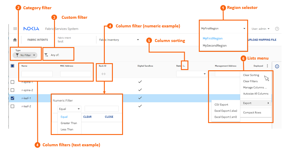
Many pages in the Fabric Services System UI display lists of objects. Wherever they appear, these lists include standard controls to help you sort and filter lists to focus on the information you need.
|
# |
Control type |
Description |
|---|---|---|
| 1 | Region selector | Most lists display a set of objects associated with a particular
region. Use this drop-down to change the region whose information is
currently displayed. Note: Each use account can be
associated with one or more regions by an administrator. Only the
regions your user account is associated with are available for
selection in the Region selector's drop-down
list. |
2 |
Category filter |
Some pages in UI can display two entirely different types of the same data. For example, the Inventory page can display a list of either physical hardware, or virtual hardware used in fabric simulations. The category field allows you to indicate which type of data you want the page to display. |
3 |
Custom filters |
You can build custom filters with multiple parameters using this control, as described in Customizing filters. |
4 |
Column filters |
You can constrain the list to show only items that match the values you specify in one or more column filters. Filtering is not supported for columns of check box values.
|
5 |
Column sorting |
Click a column title to cycle between three sorting states:
The system does not support sorting for columns of check box values. |
6 |
Lists Menu |
Click the |
Clear Sorting |
Clears all sorting that has been set for all columns of the list. |
|
Clear Filters |
Clears all filters that have been set for all columns of the list. |
|
Manage Columns... |
Opens a list of all columns in the list, which you can then enable (to show) or disable (to hide). These selections persist for subsequent visits to the same page. |
|
Autosize All Columns |
Sets the width of each column in the list to the minimum width required to display the heading without wrapping its text, and at least as wide as the filter text field for that column. |
|
Export to CSV, Export to XLSX, Export to XML |
Exports the entire table to either a Comma-separated Values (CSV) list, a spreadsheet in XLSX format, or a spreadsheet in XML format. |
|
Compact Rows |
Reduces the white space allocated to each row, fitting more rows onto each page. |
 )
) )
) icon to open a list of
common list controls that allows you to control the behavior of most
lists in the UI:
icon to open a list of
common list controls that allows you to control the behavior of most
lists in the UI:Customizing filters
You can define one or more filters to limit the set of rows displayed in any list. The fields on which you can filter, and the values to match in those fields, are determined by the system.
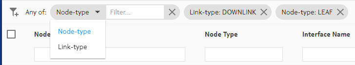
To add a custom filter to a list:
-
In the panel across the top of the list, click the
Add Filter icon (
 ).
).
- In the Filter drop-down list, click a field name from the list.
-
In the Filter field, click a value for
the field from the resulting drop-down list.
This is the value that must be matched in that field in order for a row to qualify for inclusion in the list.
- To add another filter, repeat steps 1 through 3.
- Continue adding filters until your custom filter is as precise as you need.