Working with data grids
Many pages in the EDA GUI display lists of featuring rows and columns of data. The options described here for managing such data grids are common to most data grids in the EDA GUI.
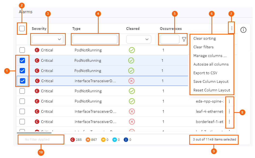
| # | Name | Function |
|---|---|---|
| 1 | Row selectors | Use these to select one or more individual rows. |
| 2 | Multiple row selector | Use this to toggle between selecting all rows, and un-selecting all rows. |
| 3 | Selection filter | Select a value to filter the list based on matching values in that column. |
| 4 | Text string filter | Enter an alphanumeric string to filter the list based on matching values in that column. |
| 5 |
Logical filter (with filter menu icon) |
Create a logical expression, which can include multiple criteria and a choice between AND and OR requirements, to filter the list based on matching values in that column. |
| 6 | Standard table actions | Select from a set of actions common to all tables. |
| 7 | Table settings and actions button | Click to open the menu of standard table actions. |
| 8 | Table row actions button | Click to select from a set of actions specific to the data in that row. |
| 9 | Row and selection counter | Indicates the total number of rows, and the number of rows that are currently selected. |
| 10 | Filter counter | Indicates how many filters have been applied to result in the currently displayed data set. |
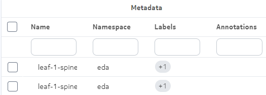
Nested columns
Columns may be collected into groups; in this case, individual columns are nested within a higher-level column for that group. For example, several columns pertaining to resource metadata are nested within a Metadata column.
Managing displayed columns
For any table, you can select which columns are displayed and which are hidden from view.
In the list of standard table actions, click Manage columns... to open a Manage Columns dialog. This dialog lists all available columns; those checked are included in the data grid, and those unchecked are excluded. By default, some possible columns may already be excluded from view.
Select or un-select the available columns and click Apply to close the dialog and update the data grid display based on your selections.
To restore the default configuration for the data grid, click the Table settings & actions icon and select Reset Column Layout from the action list.
If the set of columns exceeds what can be shown at one time in the display area, the EDA UI adds a scroll bar to the bottom of the data grid. Scrolling horizontally moves all columns to the left or right as you would expect.
By default, the Name and Namespace columns are pinned to the left for all data grids that include them. When scrolling horizontally, these columns remain visible at the left edge of the display.
Sorting
For any table, you can sort the row order based on the values in any column by clicking on the title for that column. EDA displays a sorting icon next to the column title to indicate that sorting is active.
Clicking on the title again toggles between ascending and descending order.
- adds each successive column to the sort order
- displays the sorting icon next to each column title
- displays a number next to each column title to indicate its rank in the overall sorting order
To clear all sorting from the data grid, click the Table settings & actions icon and select Clear sorting from the action list.
Filtering
You can filter the displayed data to include only those with specific values in one or more columns:
- For columns that display text, you can type any alphanumeric string in the field at the top of the column. The list is filtered only to show rows with the selected value in that column.
- For columns that display only a predetermined set of values, you can use a drop-down list to select a value. The list is filtered only to show rows with the selected value in that column.
- For columns that display numbers, you can click the Filter icon to build a logical filter. The filter menu allows you to choose an operator and a value, and then add additional operator/value combinations to create a complete logical expression. The list is filtered only to show rows with the selected value in that column.
To clear all filtering from the data grid, click the Table settings & actions icon and select Clear filters from the action list.
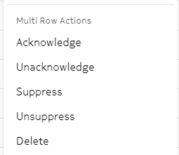
Multi-row actions
Some tables support actions that can be simultaneously applied to all selected rows. When available, these actions are displayed under a submenu of the Table settings and actions menu.
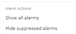
Special actions
Some tables support special actions appropriate to the particular data displayed in the list. When available, these actions are displayed under a submenu of the Table settings and actions menu.